Single-page websites seem like something that would be fairly easy to pull off. If you know nothing about the Lakeland website design industry, it certainly seems like it would only take a few hours to pull off. After all, you don’t have to worry about navigation from page to page or come up with content for each of the individual pages.
However, the very fact that it’s so straightforward is what makes it difficult. Single-page websites are very popular nowadays because of the push for the minimalist website design movement, which allows you to focus on the most essential aspects of your website design and make it easier to guide users to the conversion action.
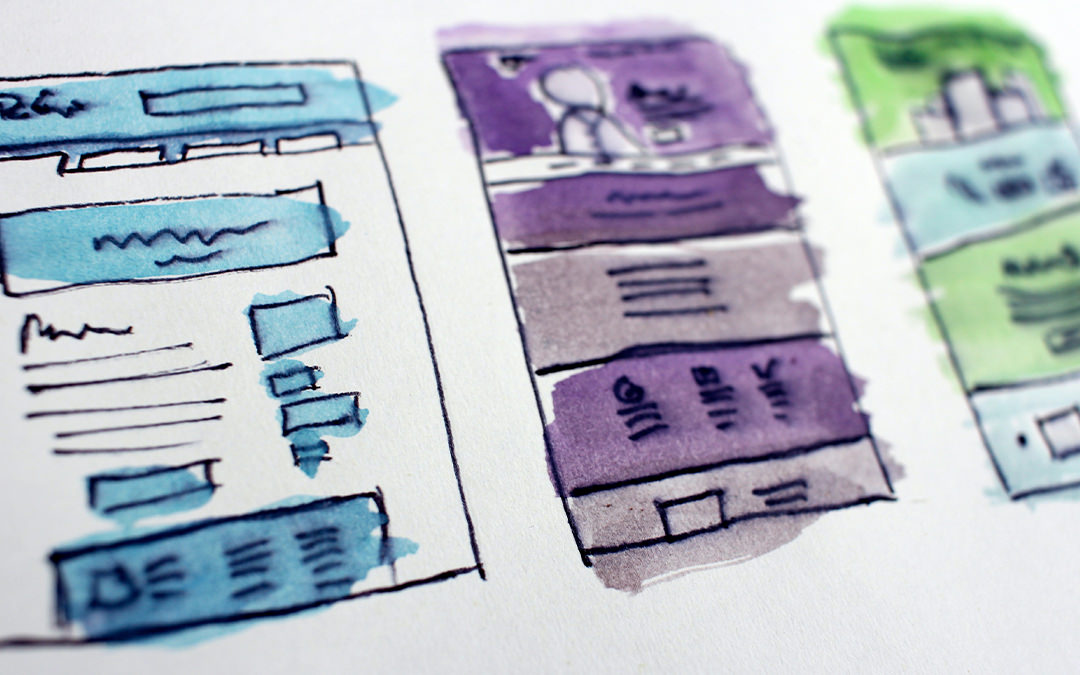
Single-pages are deceptively simple because of the fact that it’s just a single page to work with, but in reality, it can be just as difficult as a full website. After all, you’re supposed to be providing your users with all of the information that they need to make the conversion within a single page. It can be very tricky to maintain a good balance between conveying the essential information without making it too overwhelming and keeping the minimalist principle in mind without making it look boring.
Before you worry about putting a single-page design together, you have to first ask yourself if your professional website is something that would benefit from a single-page website. For example, if you sell products on your website, then you should avoid single-page sites.
Any eCommerce site, regardless of the size, will need several pages for it to succeed. These pages need to cover information like FAQs, shipping locations, and return policies. But if your website is only needed to inform users about your business or your mobile application, then this is where single-page sites come in.
When you’re putting a single-page Lakeland website together, you should make sure to think about your calls-to-action very carefully. It can be easy to overwhelm your users with your content, so you have to keep things straight to the point. You can make use of your CTAs so that your users will know where to go for the conversion action.
Content should never be disregarded, so you have to format this properly so that you do not overwhelm your users. Break up your content into easy-to-read portions and make use of white space so that users can take in the content easier. This will make it easier for users to read your content and take it in.


Recent Comments